
The movie-going experience often presents challenges, particularly for middle-aged and elderly users or those with accessibility needs. Complex ticket-booking processes and a lack of clear information about theater amenities cause frustration and hinder inclusivity.
Simplify and streamline the ticket-booking process to make it intuitive and hassle-free.
Ensure inclusivity by offering accessibility features and detailed information about theater amenities to cater to diverse user needs.
Sole UX Designer responsible for end-to-end design, including user research, competitor analysis, ideation, wireframing, prototyping, high-fidelity design, and usability testing.
3 months
Q3, 2023
This is a personal project, created during Google's UX Design Professional Certification.
The Problem
It started with a blog I read about 23 yr old Kavya’s frustrating experience at a theater that falsely claimed to be wheelchair accessible. They were left sitting apart from their family, near the exit, feeling excluded and unwelcome.
That story stuck with me. It wasn’t just about the seating—it was about dignity and the right to enjoy simple joys like a movie night. I realized how often accessibility is treated as an afterthought, leaving people with disabilities to navigate spaces that fail to meet their needs.
Inspired by this, I created MATINEE - a mobile app designed to make movie-going inclusive for everyone. By focusing on verified accessibility features and seamless ticket booking, I aimed to turn a frustrating experience into one of ease, joy, and belonging.
“ I was made to feel like an outsider in a movie theatre, despite paying for it in full ”

My Design Process

Research
I conducted one-on-one interviews with a diverse group of five participants. To ensure a well-rounded perspective, I deliberately selected individuals with varying movie-going habits and preferences. Based on the interviews, I formed two user personas.

Suchi is a school principal who needs a movie ticketing app which is easy and efficient to use because she is not very technologically savvy, has nobody else to help her out, and she’s busy.
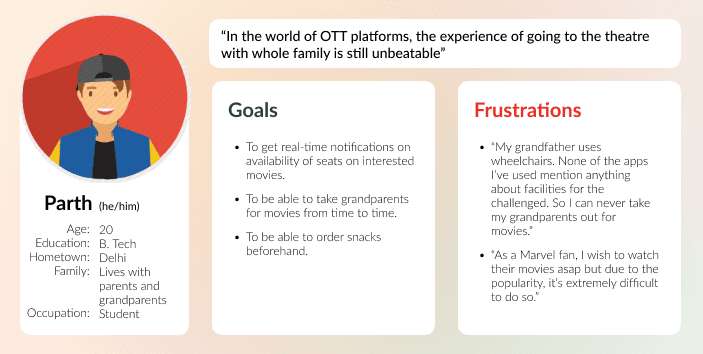
Parth is an undergrad who needs a movie ticketing app which enables him to take his grandparents out for movies because his grandparents need wheelchair-accessible theaters, but he doesn’t have a way to confirm if the theater provides that.
Pain Points
Long Queues
One of the most common pain points is waiting in long queues at the box office, especially during peak times. This can be time-consuming and frustrating.
Complexity
The apps available seem to be confusing, too complex and takes too long for people who are not that used to newer technologies.
Accessibility Info
The absence of clear and detailed accessibility information creates anxiety and hinders the decision-making process.
By drawing insights from the user interviews, I gained a comprehensive understanding of the steps users take when booking movie tickets and attending a theater.

Zooming Out

Zooming In
Design
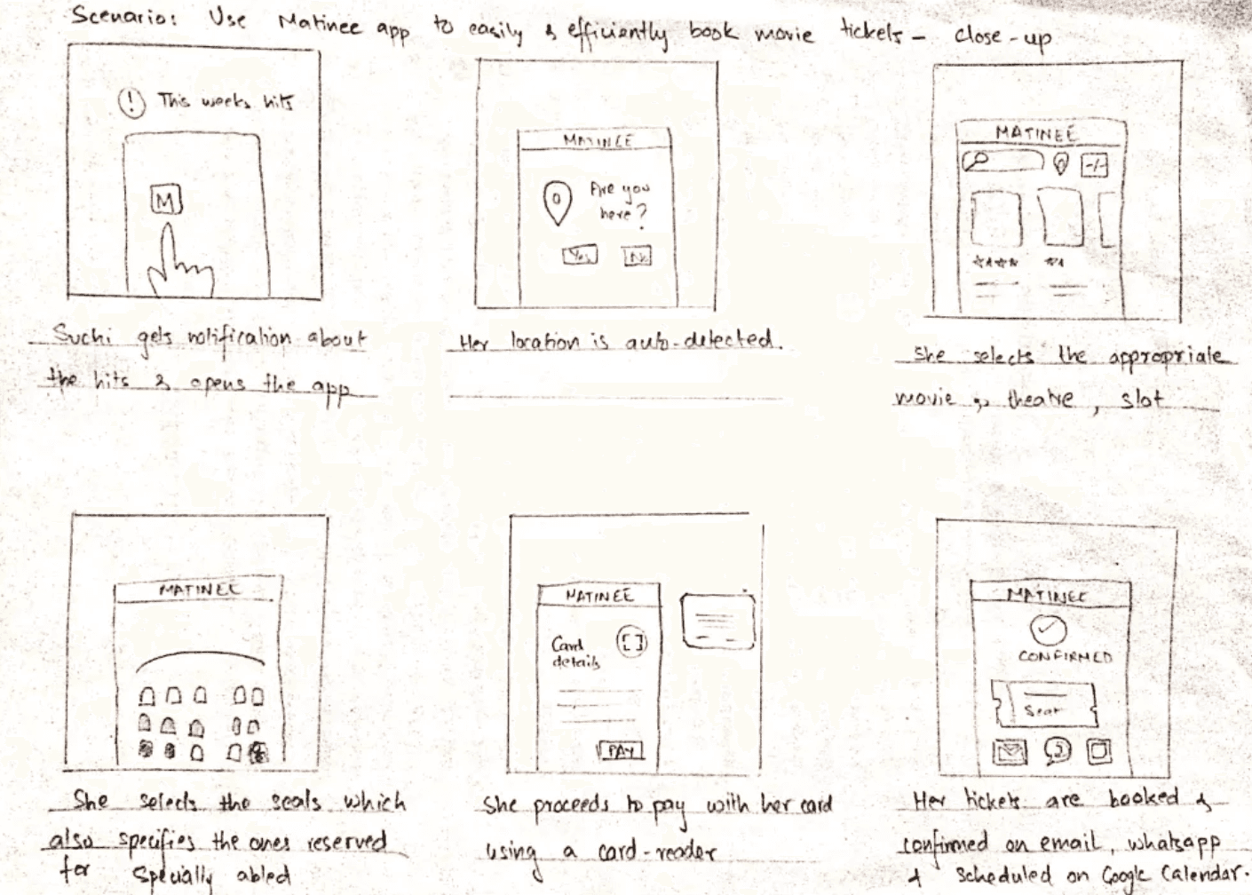
To begin the design process for the primary ticket booking flow, I created preliminary paper wireframes. These wireframes included different versions of the screens required for the flow. Afterwards, I consolidated the most effective elements from each variation into a cohesive screen design.
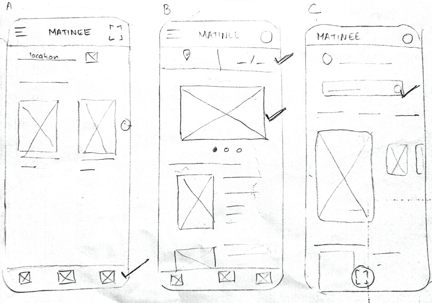

After finalizing the core screens of the flow, I created a low-fidelity wireframe using Figma. This wireframe served as the foundation for developing a low-fidelity prototype, which I used to gather user feedback.
First Usability Study
To test MATINEE’s low-fidelity prototype, I conducted an unmoderated usability study with a diverse group of participants, including individuals with special needs. The study aimed to assess whether users could complete essential tasks, determine ease of use, and evaluate how well the app addressed their pain points.
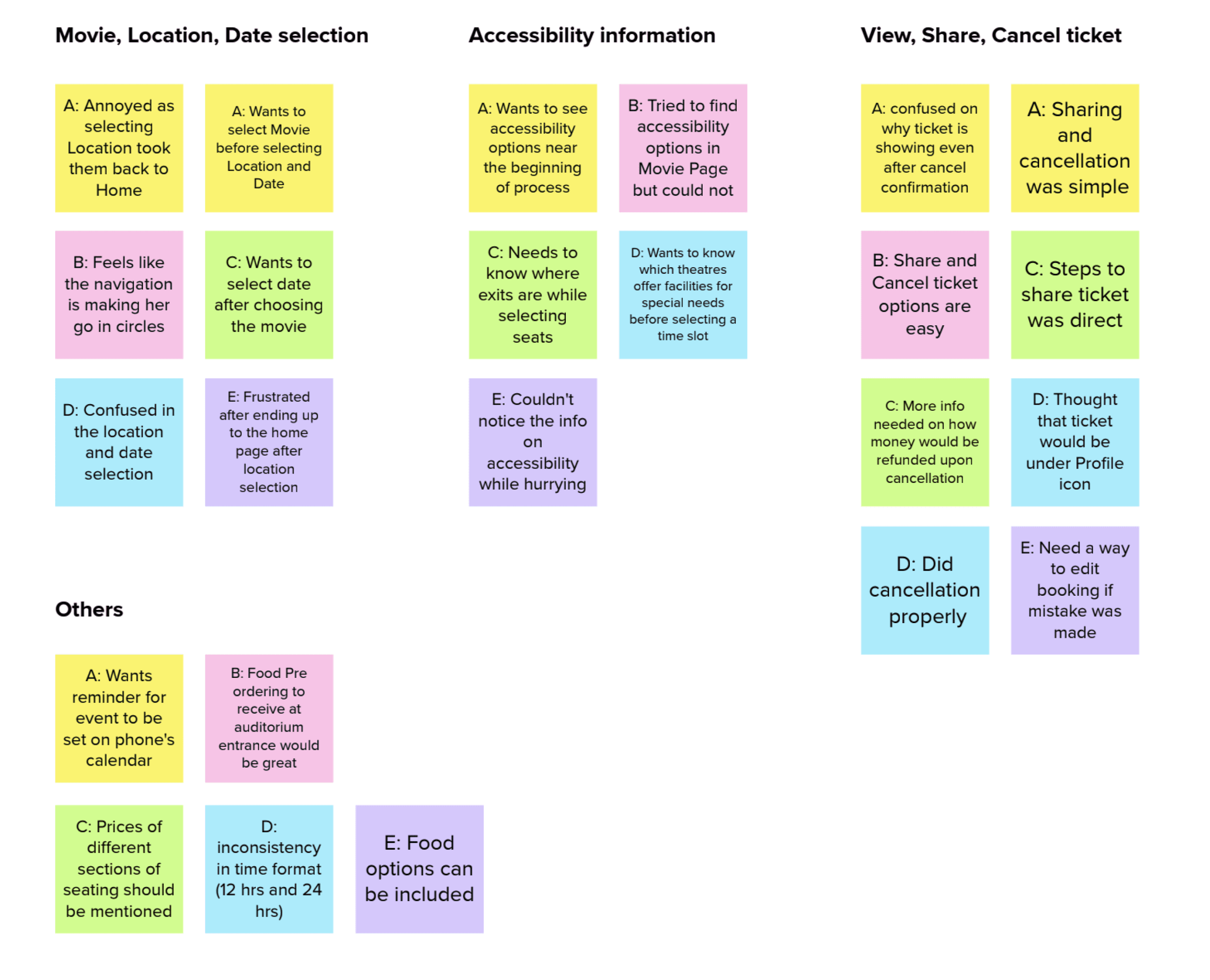
The study revealed key insights into user preferences and frustrations, which I organized using an affinity map to identify patterns and prioritize improvements.
After diving into the usability study feedback, here’s what users taught me—and how MATINEE leveled up because of it:
Users were confused about when and where to select their location and date.
Added the option to select location and date before or after picking a movie for a more intuitive flow.
Accessibility options weren’t visible early enough in the process.
Let users filter theaters based on accessibility needs before reaching the seat selection stage.
Users wanted their bookings integrated with their calendars for reminders.
Added features to sync bookings with device calendars and send timely notifications.
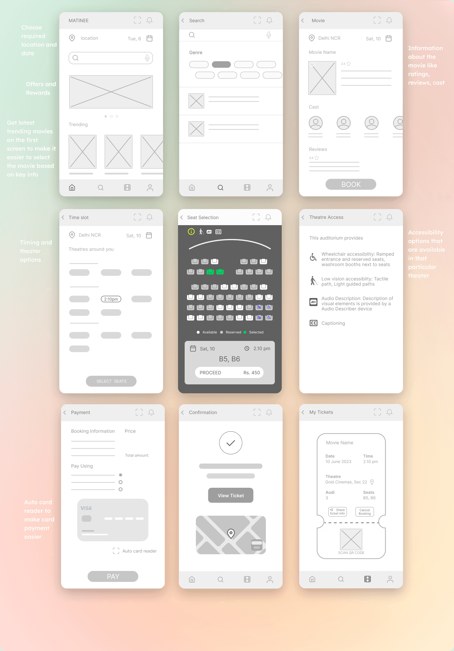
High Fidelity
With the low-fidelity prototypes polished and prepped, I hit the creative fast-forward button and dove straight into crafting the high-fidelity prototypes.

Second Usability Study
To assess the overall user experience of the app and determine whether users find the standout features useful, I conducted another usability study similar to the previous one
Most users found the information on theaters inadequate and filtering can be a bit time-consuming

Most users wanted to know the prices of seats before selecting them and wanted to know where the exits are

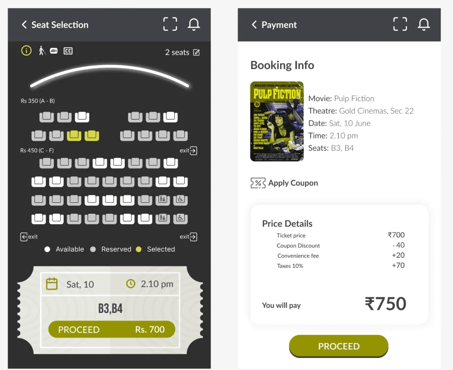
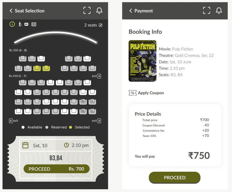
Key Features

Filter out theaters based on your accessibility needs
Get detailed information on how the facilities are incorporated


Cancel your ticket
Share with your contacts
Add a reminder to your calendar and be stress-free
Reminder for booked shows and notifications for upcoming shows


Check out the prototype in action
Visual Identity
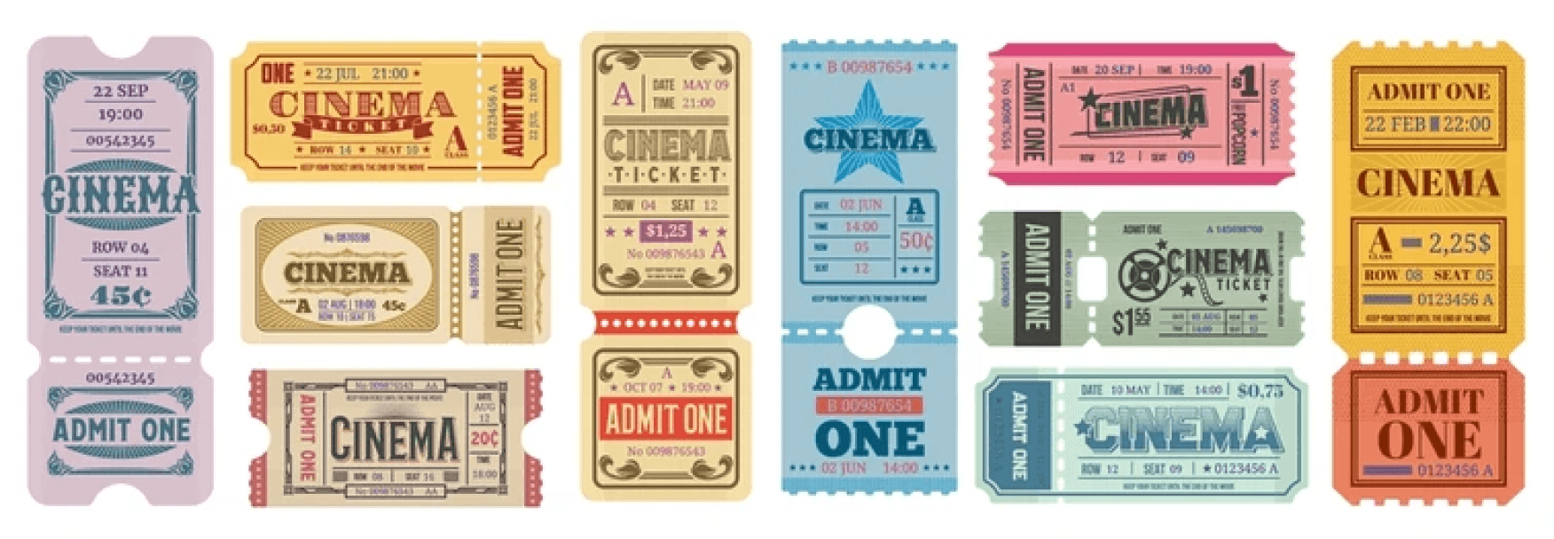
Designing MATINEE was like stepping into a time machine—straight to the golden era of retro cinema! The aesthetics take a nostalgic detour, inspired by the charm of matinee shows that older generations remember fondly. Instead of chasing sleek, modern looks, I embraced warm, familiar vibes that feel welcoming, especially for middle-aged and elderly users.
Retro - Inspired Colors
The palette echoes vintage film posters and theater interiors, sparking a sense of nostalgia and comfort.

Balancing Typography
The typography in MATINEE is all about balance. Bebas Neue brings bold, retro charm to the headings, while Lato keeps the body text modern, clean, and effortlessly readable. A perfect mix of style and simplicity!

Simple UI Components
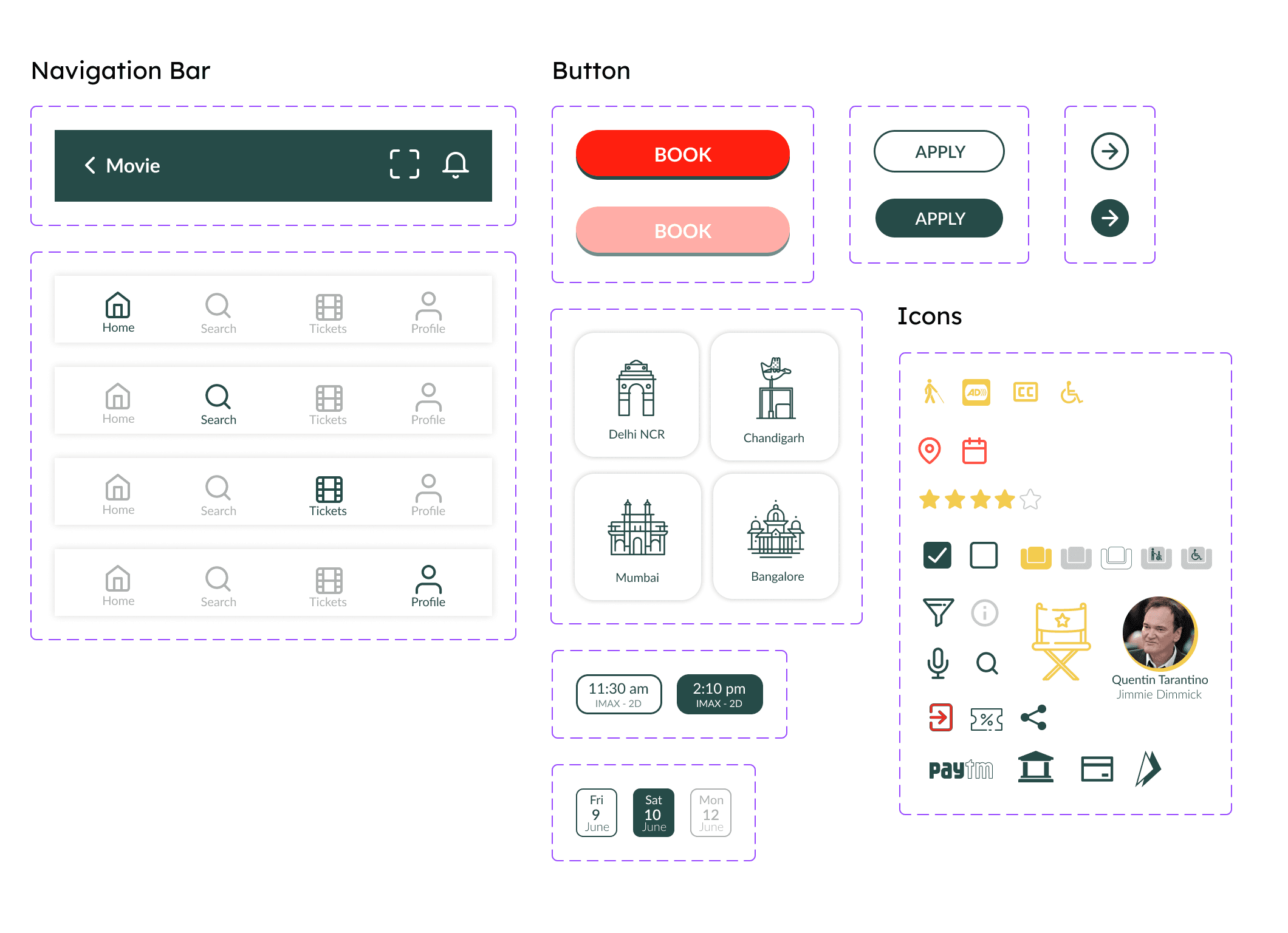
The ticket page is a delightful throwback to classic matinee tickets, reimagined with all the essential details and quick actions you need. Old school charm meets modern convenience!

Accessibility considerations
I have used a chrome extension called Colorblindly, to simulate 8 types of colorblindness, out of which some are shown below. These helped me understand if the buttons and icons were distinguishable.
Green-Blind / Deuteranopia

Blue-Blind / Tritanopia
Red-Blind / Protanopia

Blue Cone Monochromacy / Achromatomaly
Foreground and Background Contrast Ratio is 9.62:1 (4.5:1 is the minimum required by WCAG)
WCAG AA and AAA: Passed
Content is displayed in a simple linear layout, so that it is convenient for people who are using screen readers.
Reflections
What did I learn
Next Steps
Enhancing Accessibility
The product design should continue to evolve to enhance its accessibility features, ensuring that it accommodates a wider spectrum of disabilities. These improvements should align with established accessibility guidelines.
Iterative User Testing
The design of a product should be continuously improved through ongoing usability testing with diverse user groups. This process helps to identify and address any remaining usability issues and areas of user dissatisfaction related to the design.
Scalability and Consistency
Ensure that the UX design maintains consistency across different devices and screen sizes, adhering to responsive design principles. Consider how the design will scale as the app expands to cover more theaters and cinema chains.
Back